From Downtown Views to Iconic Identity: Thea in Downtown LA
A Multifamily Case Study by Tenderling Brand Strategy & Design
- 12 February 2025
- Tenderling Team
- 8 min read
A Tenderling Deep Dive
In the heart of downtown Los Angeles, where grit meets glamour and skyline views compete with street art, Tenderling was brought in to name and brand a bold new multifamily project. The development team had a vision: elevate the residential experience while reflecting the cultural richness and edge of DTLA on a level of luxury never experienced in residential luxury living. What they didn’t have yet? A name. A story. A brand.
That’s where we came in.
Starting with a Blank Canvas
Our ambitions were sky-high—literally. This was to be a 50+ story glass tower designed for modern urban dwellers who crave beauty, culture and access to everything.
We knew this identity needed to be:
- Feminine without being fragile
- Elegant yet grounded in place
- Distinctive enough to rise above the noise
Our first step was to dive into the psychographics of the ideal resident—who they were, what they valued and how they made decisions. Through our Brand Profile™ framework, we unearthed the emotional levers and aesthetic preferences that would define this brand.
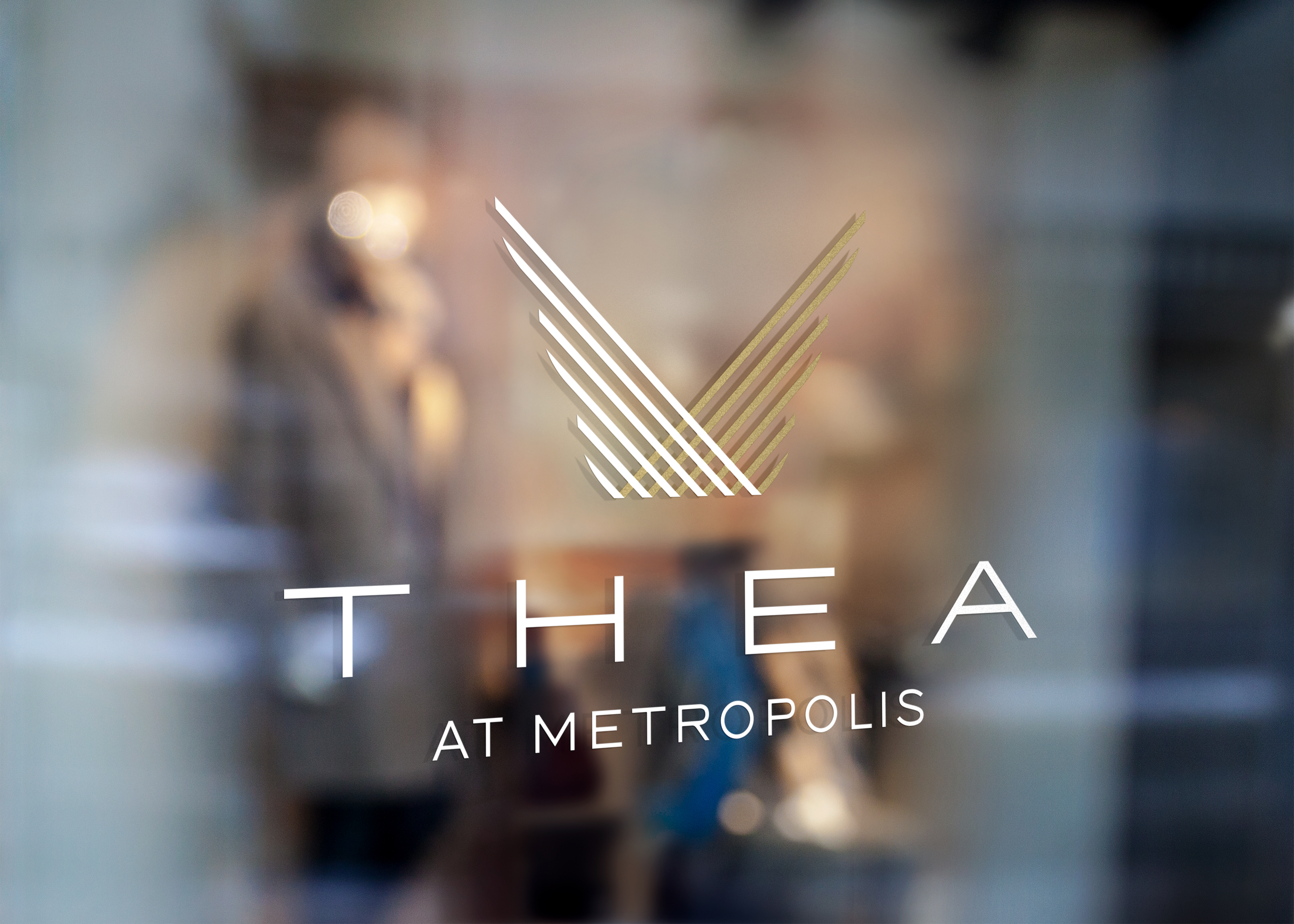
The Name: Thea
After dozens of rounds exploring mythological, botanical, geographic and invented names, Thea rose to the top.
It’s a nod to the Greek titaness of sight and heavenly light—fitting for a tower that captures the sun from every angle. Soft and luminous, the name evokes an aura of understated luxury while being completely ownable in the market.
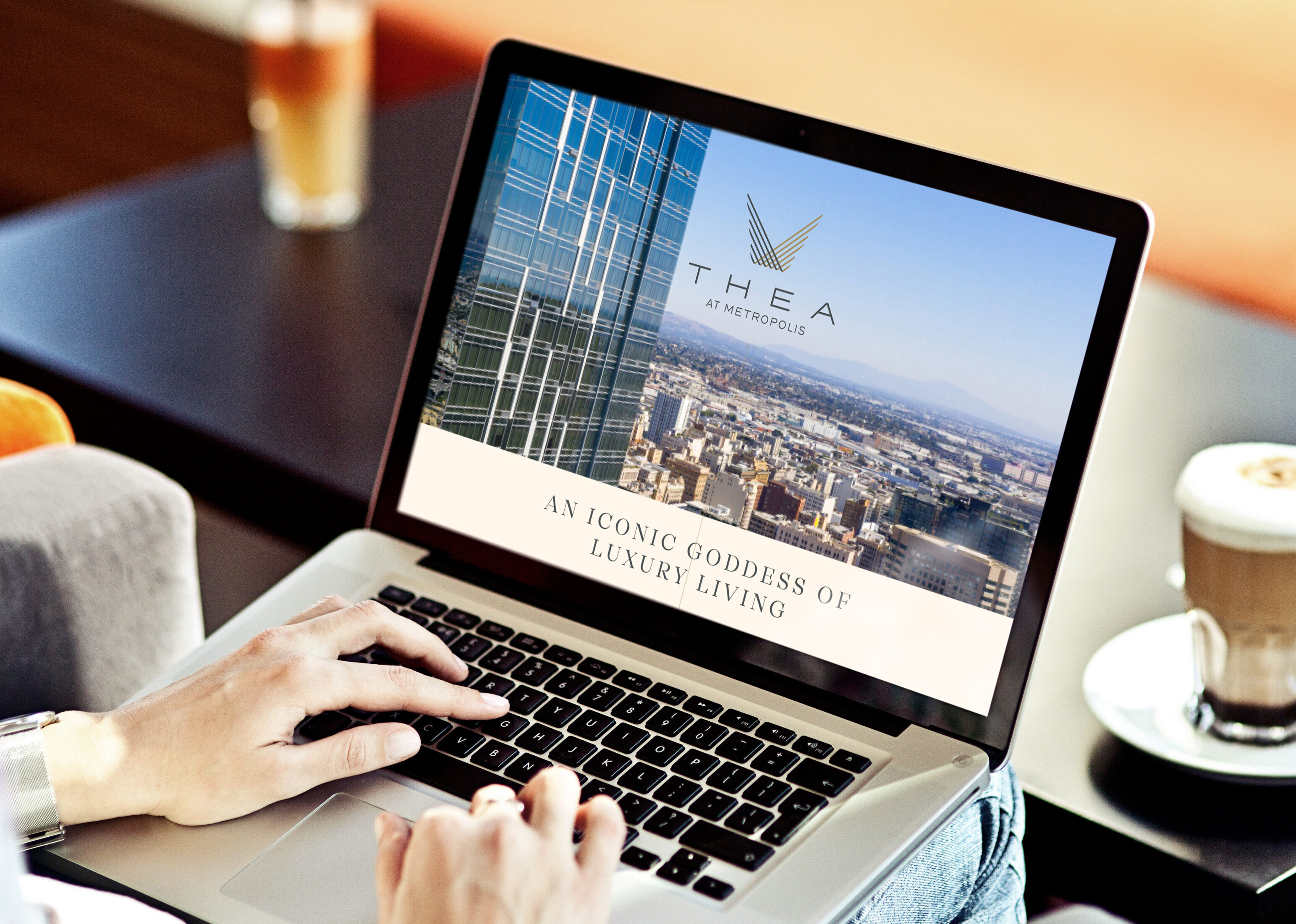
Crafting the Visual Language
With the name in place, we moved into the full brand build:
- Logo: A custom serif wordmark with graceful ligatures that suggest architectural movement.
- Color Palette: Muted blushes, bronzes, and twilight blues—grounded and warm yet elevated.
- Typography: Editorial-inspired but approachable, playing into Thea’s identity as stylish yet livable.
- Textures & Photography: A rich blend of lifestyle moments, high-design interiors and atmospheric light.
Our design had to balance cosmopolitan luxury with a connection to Los Angeles’ artistic pulse. The result was a visual identity that feels like a private gallery opening—exclusive, aspirational, but never cold.
The Brand in the World
As Thea prepared to launch, the brand extended into:
- Lease-up campaigns and signage
- Sales center interiors and collateral
- Website and digital assets
- Resident onboarding experiences
We partnered closely with the developer’s marketing team and leasing consultants to ensure every touchpoint reinforced the story. From the moment a prospect passed the site signage to the day they turned the key, the Thea experience felt seamless, confident and intentional.
Results
- Fast-tracked leasing velocity despite market saturation in downtown
- Consistent 5-star Google reviews praising the aesthetic and experience
- Repeated press mentions highlighting the design-forward brand
- A waiting list for certain floor plans even before full build-out was complete

Closing
Whether you’re launching in a high-rise, a boutique build or a garden-style community, your brand is more than just a name. It’s a first impression, a feeling and a future.